مقدمة:
في بداية المشروع، تم تقديم النسخة القديمة من الخط الخاص بمركز الملك عبد الله المالي لمراجعتها ومعاينتها. أثناء عملية المراجعة، لاحظنا وجود عدة تحديات ومشكلات في النسخة الحالية، أبرزها عدم انتظام عائلة الخط بالشكل الذي يضمن التناسق والتناغم بين أوزانه المختلفة، بالإضافة إلى رغبة العميل في إضافة وزن جديد للخط ليتماشى مع احتياجاتهم المستقبلية.
عند فحصنا لملف الخط الأصلي، وجدنا أنه يتمتع بميزات تصميمية ملفتة من حيث الشكل العام، إذ يعكس توجهًا حديثًا ومتناسقًا مع هوية “كافد”. هذه الهوية تستمد إلهامها من أشكال المباني الهندسية المميزة التي تشتهر بها، والتي تم التعبير عنها بذكاء من خلال تصميم الخط. ومع ذلك، كانت هناك بعض الجوانب التي تطلبت إعادة النظر والتحسين لضمان جودة الخط وتطابقه مع رؤية العميل وتطلعاته.
بدأنا الخطوة التالية من خلال دراسة وتحليل الحروف التي تم تصميمها سابقًا بشكل دقيق، حيث ركزنا على تحديد المشاكل الجوهرية التي تؤثر على انسجام التصميم وقابليته للاستخدام في مختلف التطبيقات. تضمنت هذه الدراسة التركيز على تفاصيل الرسم، ضبط التناسق بين الحروف، وتحسين الأوزان بما يحقق تجربة استخدام متكاملة.
حرصنا على أن تكون عملية التطوير شاملة، حيث قمنا بتحديد نقاط الضعف والعمل على تحسينها مع الحفاظ على جوهر الهوية التصميمية التي تميز الخط. يمكنكم متابعة جميع التفاصيل المتعلقة بالمشاكل السابقة والخطوات التي قمنا باتخاذها عبر الصور المرفقة أدناه، والتي توضح بشكل مرئي مسار العمل والتطورات التي طرأت على تصميم الخط.
:introduction
At the beginning of the project, the old version of the King Abdullah Financial District (KAFD) typeface was submitted for review and evaluation. During the assessment, several challenges and issues in the current version were identified—most notably, the inconsistency within the font family affected the visual harmony across its different weights. Additionally, the client expressed a desire to add a new weight to better align with their future needs.
Upon examining the original font file, we found that it possessed strong design features in terms of overall appearance, reflecting a modern direction that aligns well with KAFD’s identity. This identity draws inspiration from the district’s iconic architectural forms, which were thoughtfully echoed in the font’s design. However, certain aspects required refinement to ensure the font’s quality and alignment with the client’s vision and expectations.
We then studied and analyzed the previously designed letterforms in detail, focusing on identifying core issues that impacted the coherence and usability of the typeface across various applications. This included refining drawing details, improving the consistency between characters, and enhancing the font weights to deliver a more complete and polished user experience.
We made sure the development process was comprehensive—addressing all areas needing improvement while preserving the distinctive design essence of the font. You can follow the full breakdown of the identified issues and the steps taken to improve the typeface in the images attached below, which visually illustrate the evolution of the design.
حول الخط:
خط كافد هو خط عصري عالي التباين غير مروس مستوحى في تصميم حروفه العربية من أسلوب الخط الكوفي. يدعم الخط كلا من اللغتين العربية واللاتينية ويتوفر بثلاثة أوزان بنسخته القديمة.
بعد إجراء فحص شامل للخط، ظهرت العديد من المشكلات المتعلقة بالتصميم والبرمجة والتباعد في الحروف العربية واللاتينية على حد سواء. سنحرص على الحفاظ على الطابع العام للخط لأنه يتميز بفرادته وقد أصبح رمزًا لهوية كافد. ومع ذلك، سنقوم بإعادة بناء الخط بالكامل من الأساس مع الحفاظ على شخصيته الفريدة ومعالجة جميع المشكلات الأخرى، التي سيتم توضيحها بالتفصيل.
:About The Typeface
The KAFD font is a high-contrast contemporary sans-serif typeface. Its Arabic letters are inspired by the Kufic style. It supports both Arabic and Latin languages and consists of three weights.
After a comprehensive examination of the font, several issues related to design, programming, and spacing in both Arabic and Latin characters became apparent. We will preserve the font’s overall essence because it is distinctive and has become synonymous with KAFD. However, we will completely rebuild the font from the ground up while maintaining its unique characters and addressing all other issues, which will be detailed in this document.
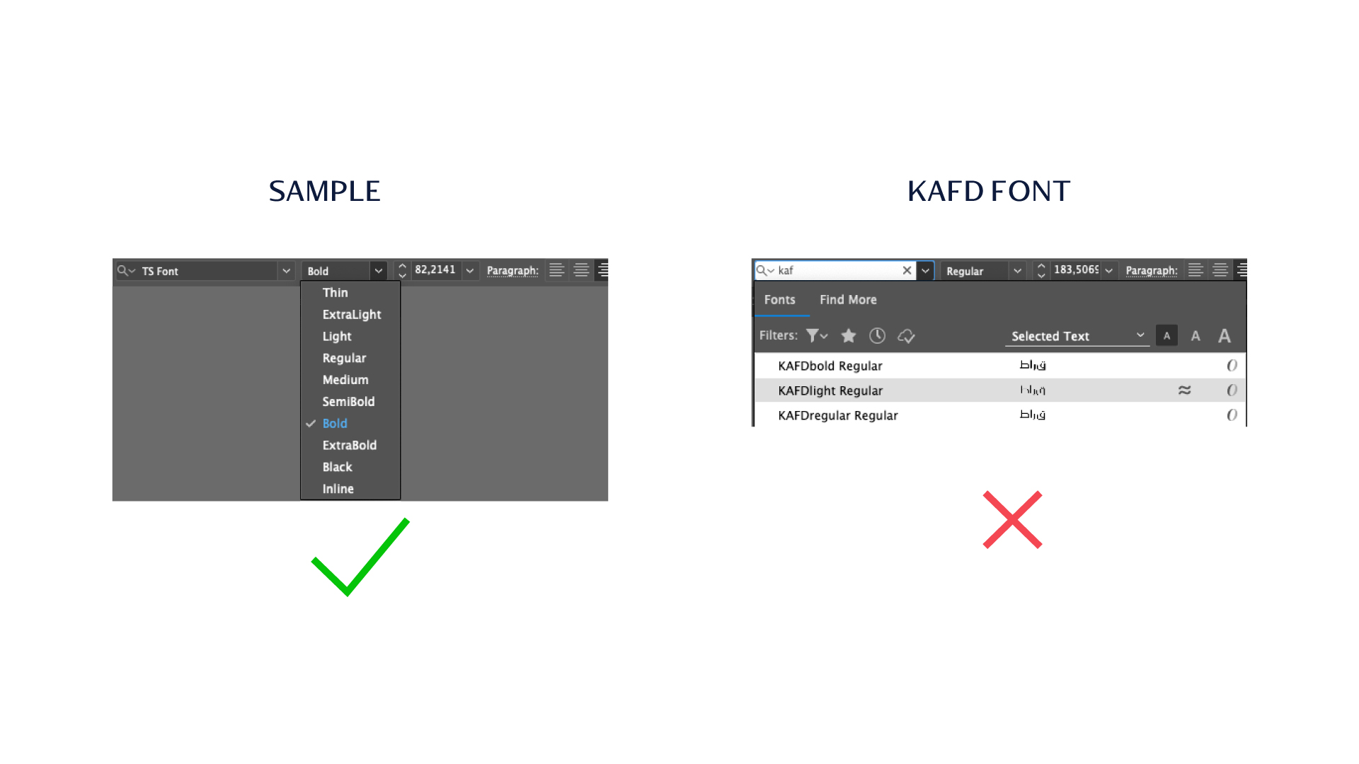
مشكلة عائلة الخط:
نظرًا لأن الخط يحمل اسمًا مختلفًا، فإن أوزانه لا تندرج تحت نفس العائلة الطباعية
:Font Family Issue
Due to the font having a different name, its weights do not fall under the same typeface family.
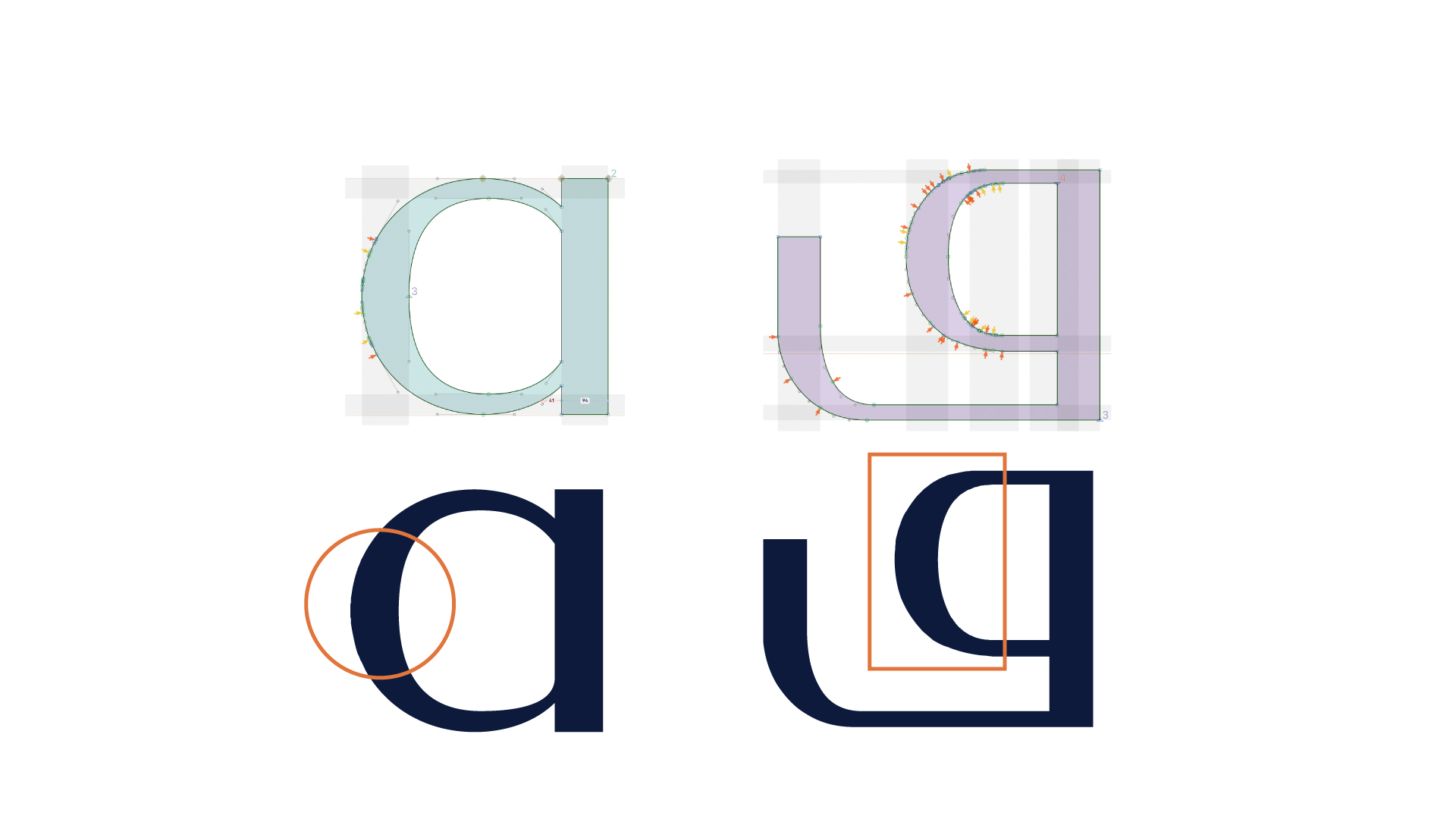
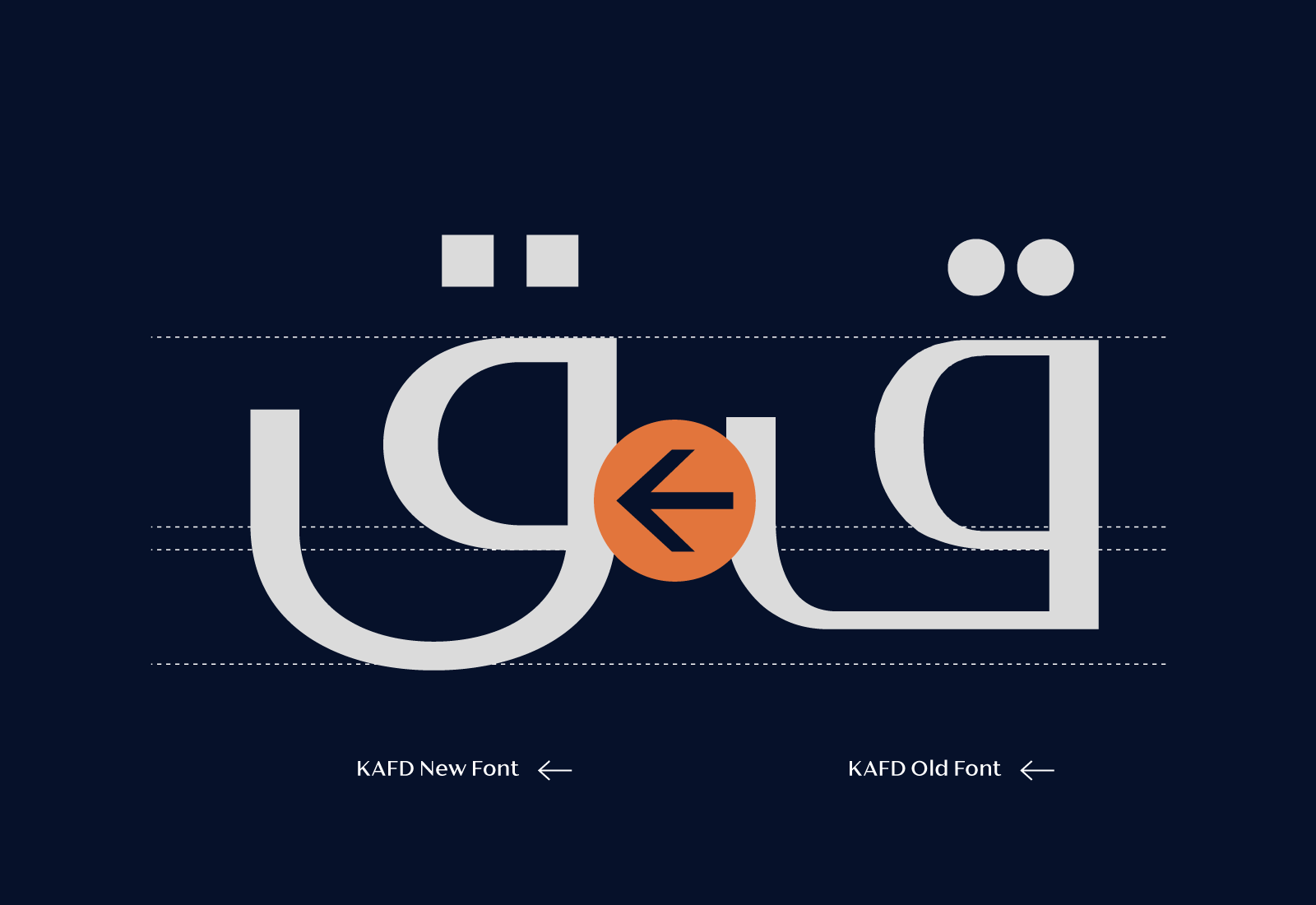
مشكلة عيوب الرسم:
عند تحليل تفاصيل الحروف القديمة، يظهر وجود العديد من المشكلات في تصميم الحروف، بالإضافة إلى العدد الكبير من نقاط الرسم. هذه العيوب تؤدي إلى اضطرابات في دقة الرسم وتؤثر سلبًا على سرعة أداء الخط أثناء الاستخدام.
:Drawing Issue
An analysis of the previous letterform details revealed several design flaws, including an excessive number of nodes. These issues compromise the precision of the letter shapes and negatively affect the font’s performance and rendering speed during use.
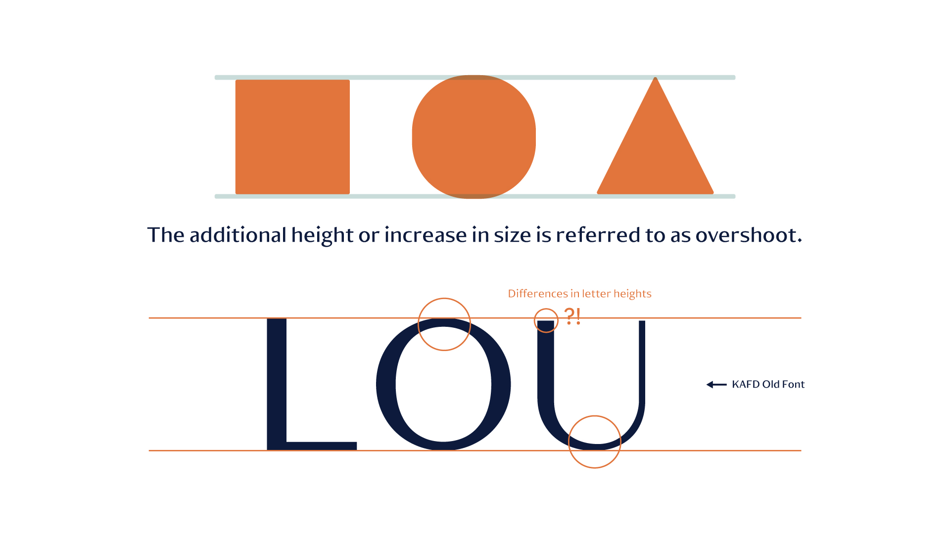
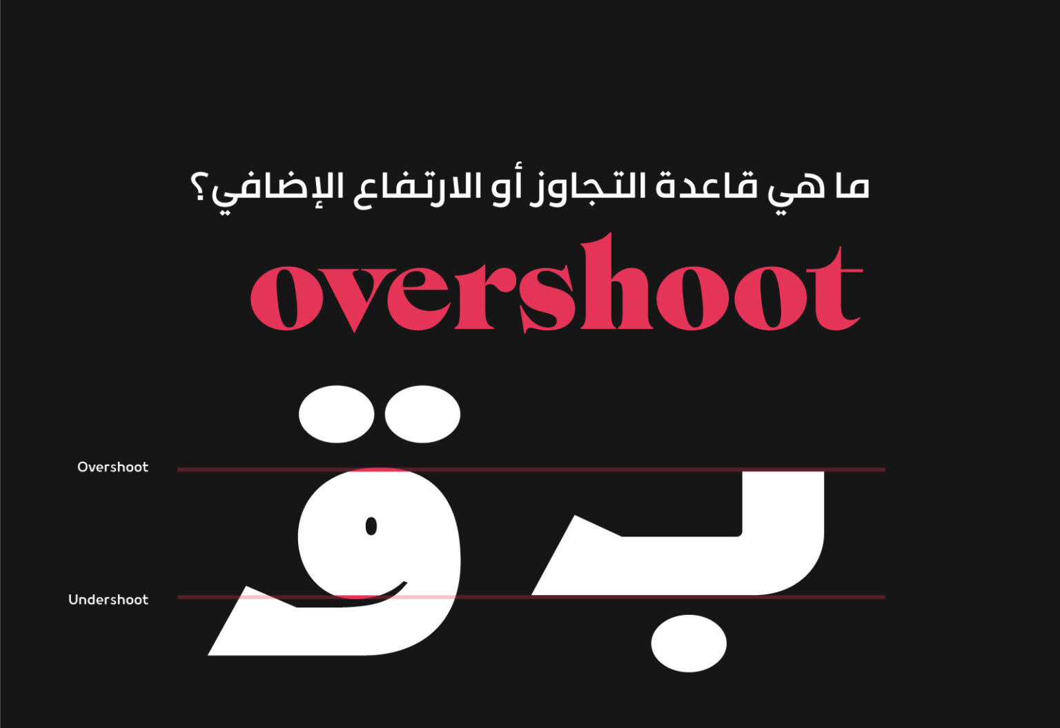
مشكلة في تطبيق قاعدة التجاوز:
لتحقيق التوازن البصري وجعل الدوائر والمثلثات تبدو أكبر وأكثر انسجامًا مع المربع، يتم إضافة زيادة طفيفة. تهدف هذه
الزيادة إلى تعزيز تأثيرها وجعلها أكثر بروزًا، مع تقليل تأثير الفراغ السلبي المحيط بها على الشكل النهائي.
لفهم هذه القاعدة بشكل أفضل يمكنك قراءة المقالة اضغط هنا
:Overshoot Issue
To achieve visual balance and make the circles and triangles appear larger and more balanced about the square, their sizes are slightly enlarged. This enlargement serves to enhance their impact and make them more prominent while helping to reduce the influence of the negative space surrounding them on the final shape.
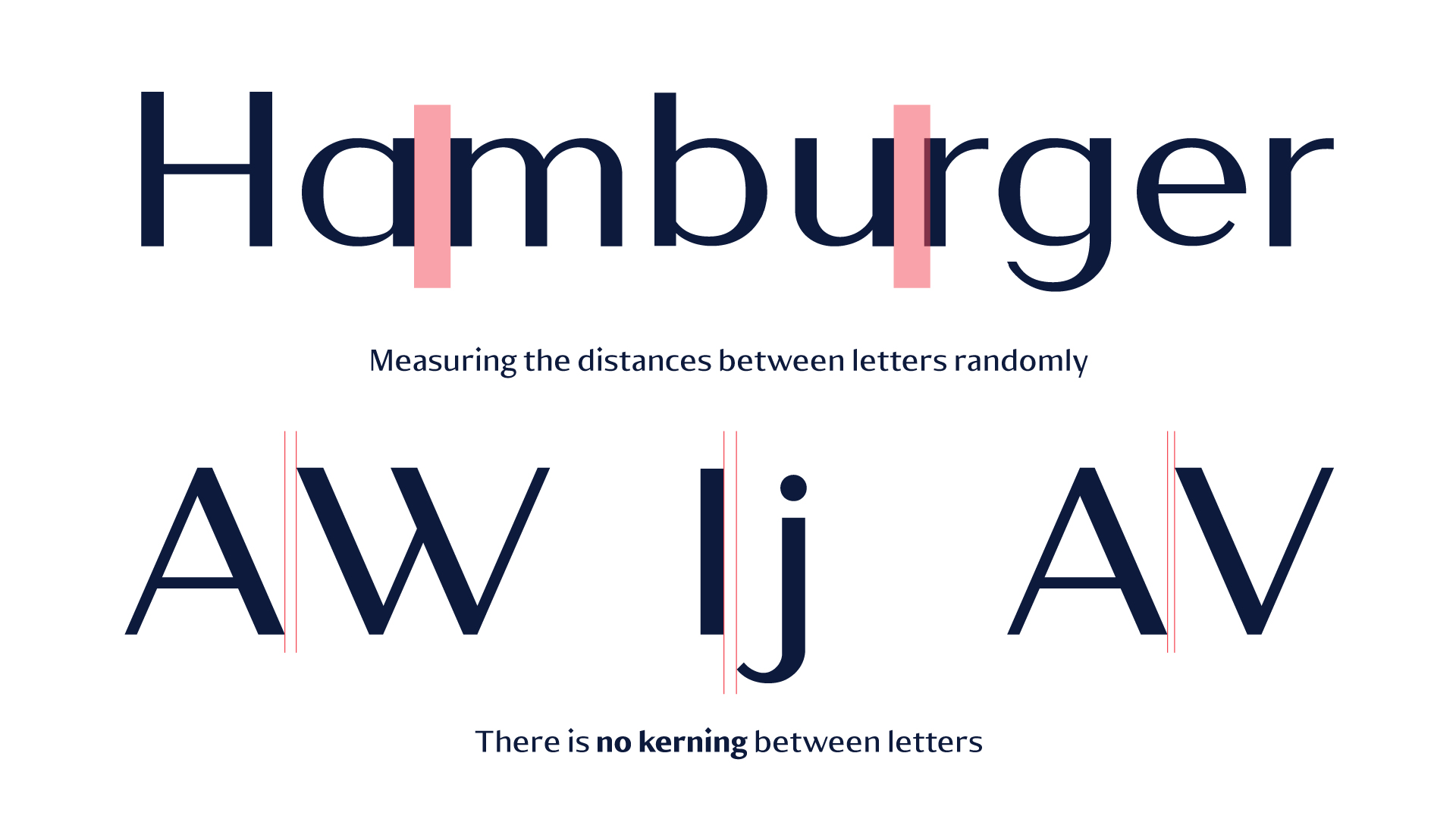
مشكلة المسافات بين الحروف:
.في خط كافد السابق لم يكون هناك مراعاة للمسافات والتباعد بين الحروف
Letter Spacing Issue:
In the previous KAFD font, letter spacing and kerning were not properly considered, resulting in inconsistent spacing between characters.
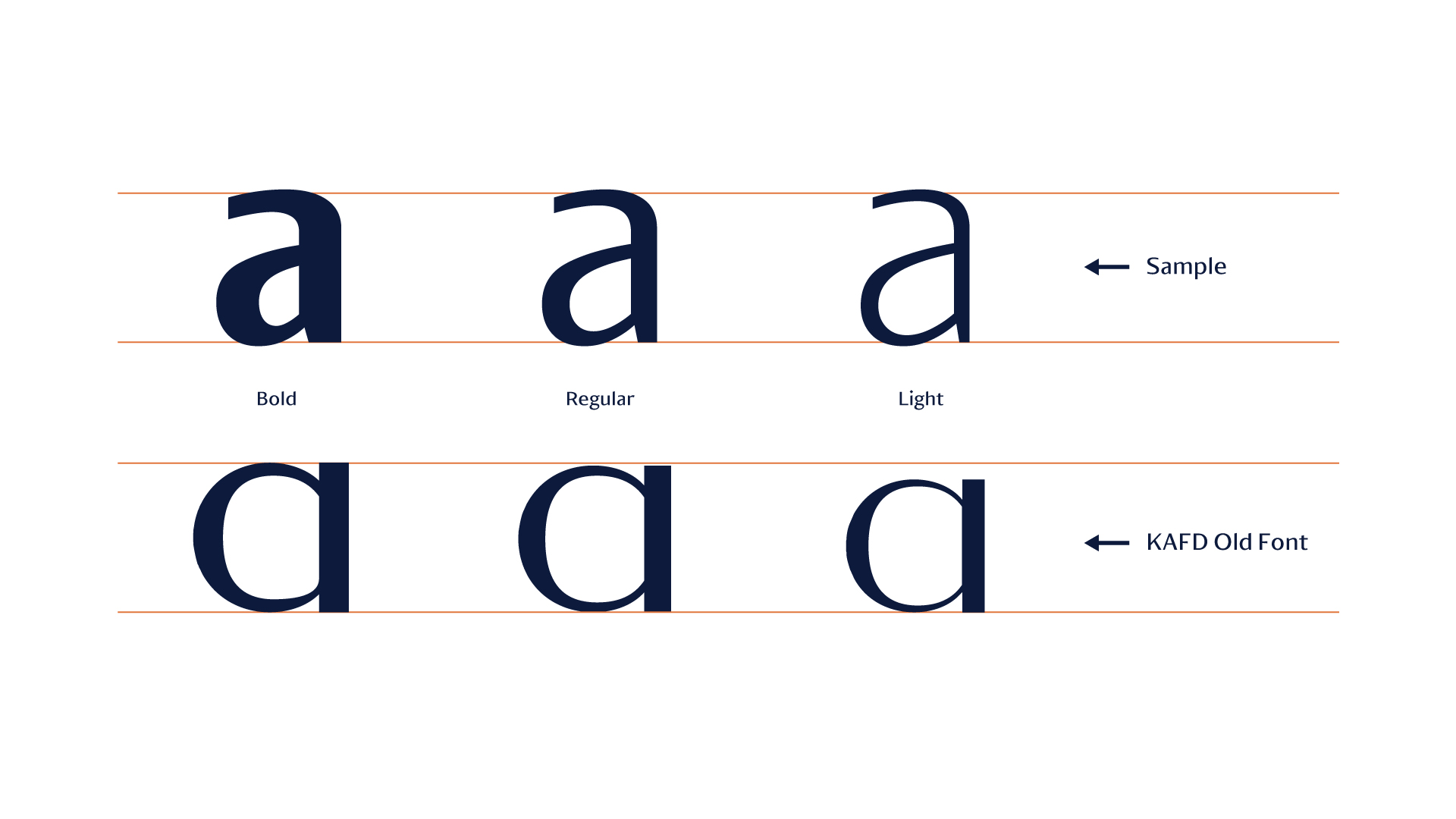
مشكلة أوزان العائلة:
الأوزان تمثل المشكلة الرئيسية في الخط، حيث إنها لا تعكس مفهوم سمك الحروف والمساحات البيضاء، بل هي مجرد تغيير في حجم الحروف فقط.
:Weights Issue
The weights are the major issue in the font because they do not represent the concept of letter thickness and whitespace; rather, they are simply a resizing of letter sizes.
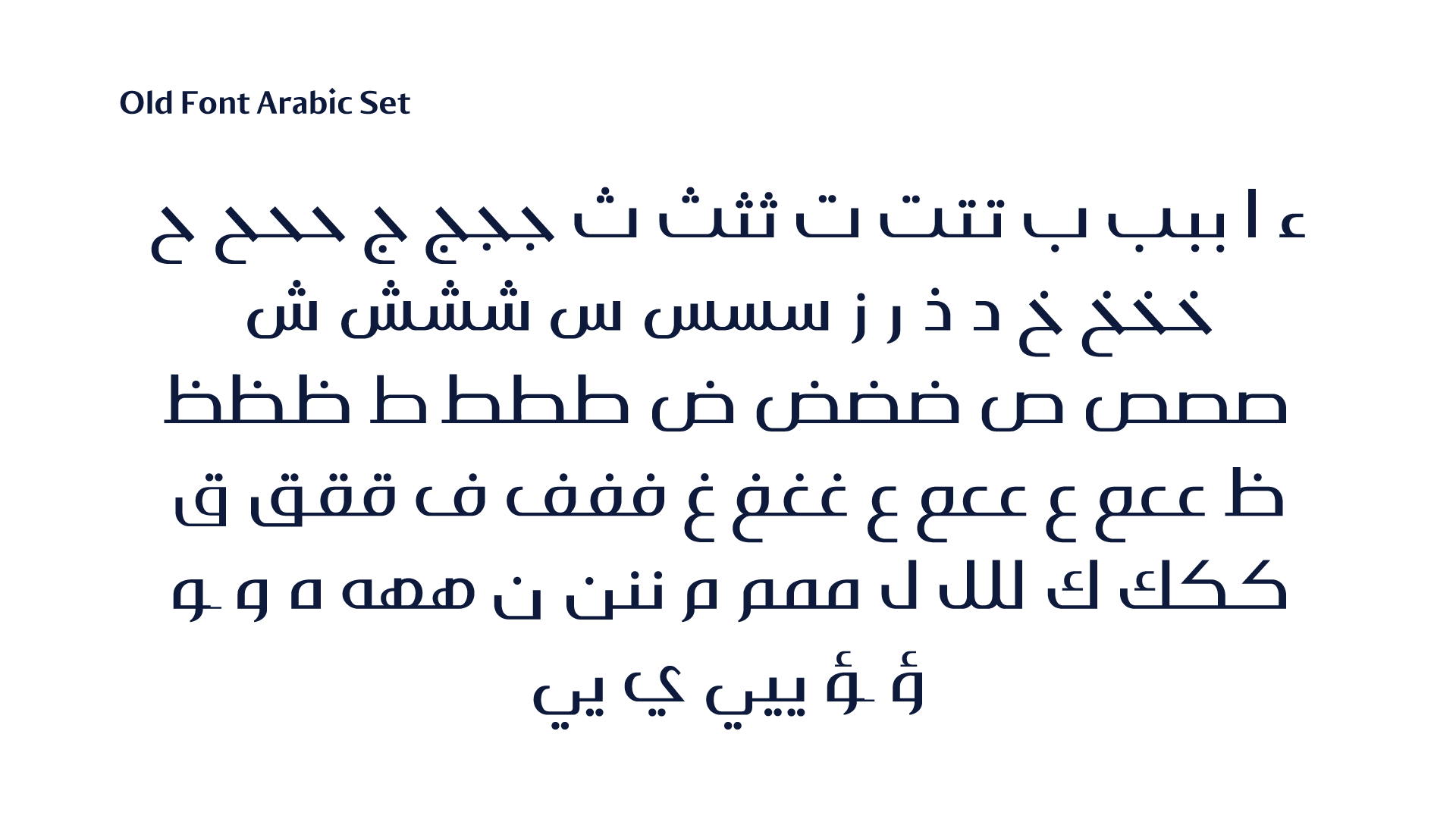
جميع المشكلات المذكورة سابقًا كانت موجودة أيضًا في الحروف العربية، بالإضافة إلى العديد من الأخطاء المتعلقة بقواعد الخط العربي.
سيتم استعراض بعض المشاكل التي واجهتنا في الحروف:
All of the previously mentioned issues were also present in the Arabic letterforms, in addition to several errors related to the rules and structure of the Arabic script.
Below are some of the specific problems we encountered in the Arabic letters:
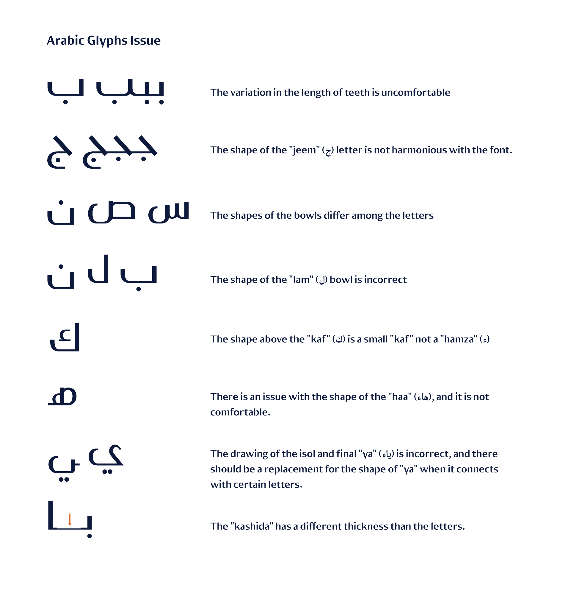
-يسبب التفاوت في طول الأسنان إزعاجًا بصريًا.
-شكل حرف الجيم غير متناغم مع تصميم الخط العام.
-أشكال الكؤوس تتفاوت بشكل غير متسق بين الحروف.
-كأس حرف اللام مرسوم بشكل غير صحيح.
-العلامة فوق حرف الكاف هي “كاف” صغيرة وليس “همزة” (ء).
-حرف هاء البداية به مشكلة في التصميم، مما يجعلها غير مريحة بصريًا.
-رسم الشكلين المنفصلة والنهاية لحرف الياء غير صحيح.
-التطويل (الكشيدة) لها سمك مختلف مقارنة بالحروف، مما يسبب عدم التناسق.
The variation in the length of teeth is uncomfortable
The shape of the “jeem” (ج) letter is not harmonious with the font.
The shapes of the bowls differ among the letters
The shape of the “lam” (ل) bowl is incorrect
The shape above the “kaf” (ك) is a small “kaf” not a “hamza” (ء)
There is an issue with the shape of the “haa” (هاء), and it is not
comfortable.
The drawing of the isol and final “ya” (ياء) is incorrect, and there
should be a replacement for the shape of “ya” when it connects
with certain letters.
The “kashida” has a different thickness than the letters.
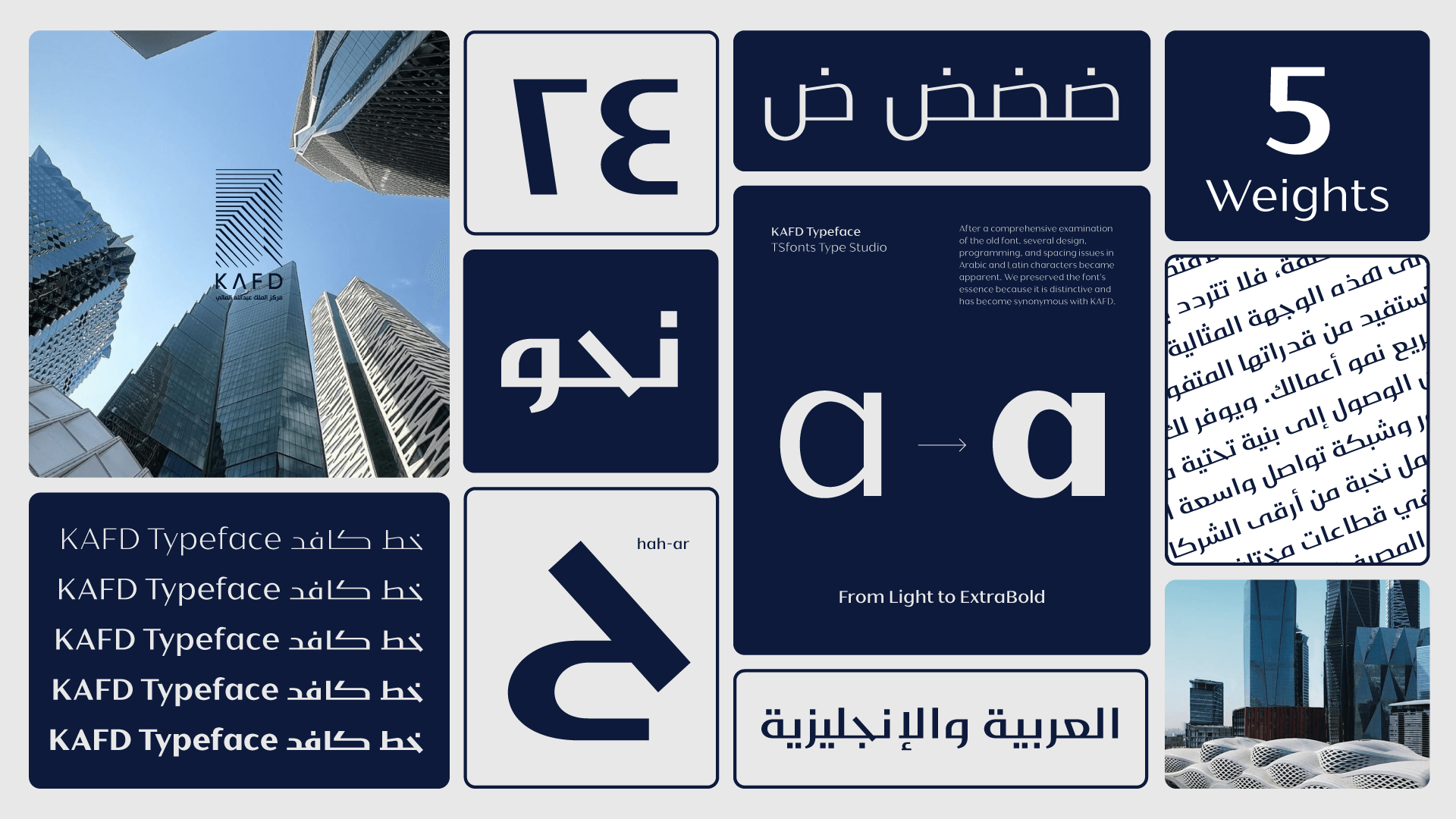
After a comprehensive examination of the old font, several design, programming, and spacing issues in Arabic and Latin characters became apparent. We preserved the font’s essence because it is distinctive and has become synonymous with KAFD.
In response, we comprehensively rebuilt the KAFD font from the ground up. During this process, we carefully preserved the font’s unique personality and stylistic elements that made it stand out. However, we significantly improved the letterforms, refined the spacing, and resolved all programming issues to ensure the font performs flawlessly across different platforms and environments. The result is a modern, polished typeface that retains the essence of its original design while offering enhanced usability and visual harmony for both Arabic and Latin.
The new KAFD font is a high-contrast contemporary sans-serif typeface inspired by the Kufic style. It supports both Arabic and Latin languages and has five weights.
Client: King Abdullah Financial District (KAFD)
Agence: brandship
Studio: TSfonts Type
Font Design: Tarek Alsawwa