- Published
- 5 min read
- Category: Education
What Is Type Design?
Introduction
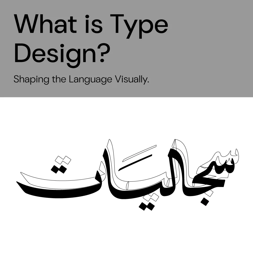
Typefaces are more than attractive letterforms. They are complete visual systems that convey an identity, a message, and a particular feeling.
Type design brings together design and engineering: visual creativity meets technical precision to create a typeface that serves its purpose.
Designing type means engineering an entire system, including letterforms, spacing, relationships between elements, and technical functionality through OpenType features.
What Is Type Design?
Type design is the process of creating a visually coherent and unified set of letters, numerals, and symbols that work together within a writing system. Its main goal is to produce a complete typeface for use across print and digital applications.
The Elements
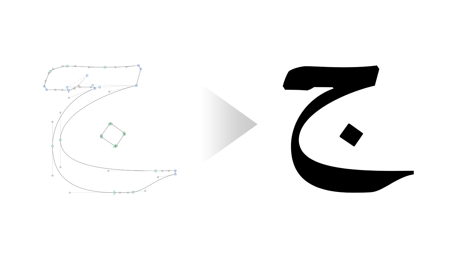
1. Glyph Design
The process usually begins with key letterforms, such as the Latin lowercase “n”, which serves as a foundation for developing the rest of the alphabet.
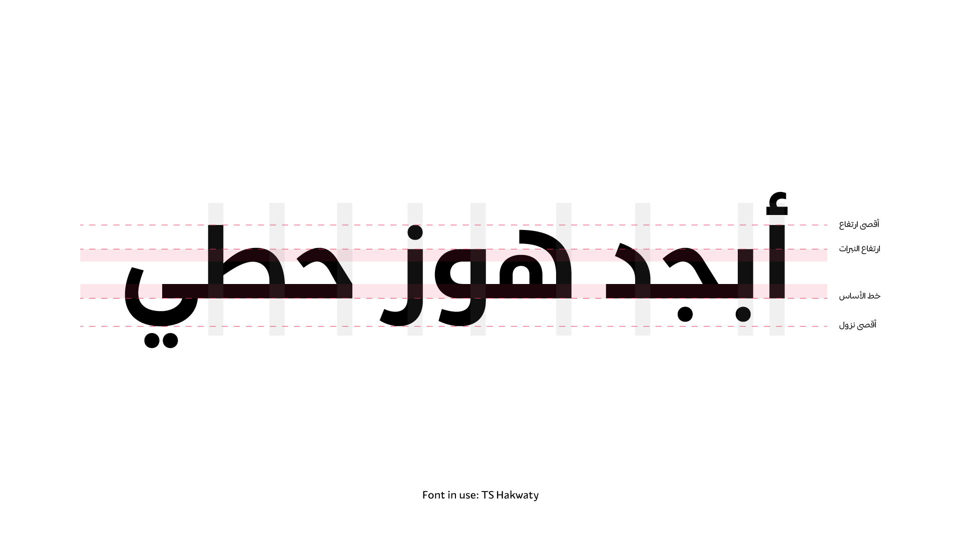
2. Proportions and Stroke Thickness
This involves determining the vertical extents of the letterforms, the thickness of horizontal and vertical strokes, and the contrast between them.
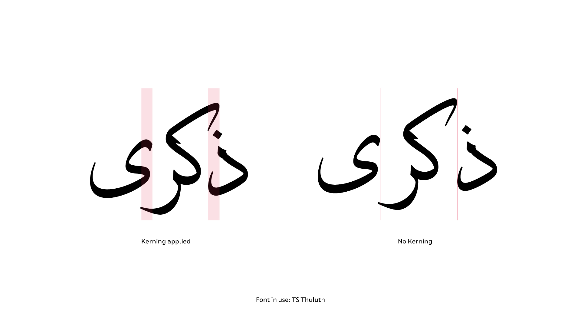
3. Spacing, Sidebearings, and Kerning
Type design is concerned not only with the shape of each letter, but also with the space between letters and the way they interact.
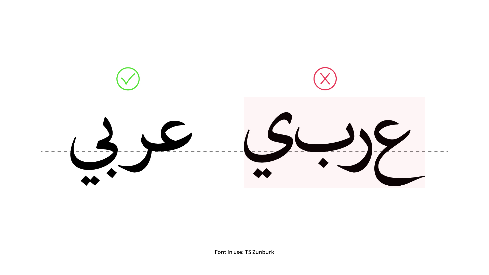
4. Language Support
A well-designed typeface should support a wide range of languages, informed by a thorough understanding of each language’s writing conventions and contextual requirements.
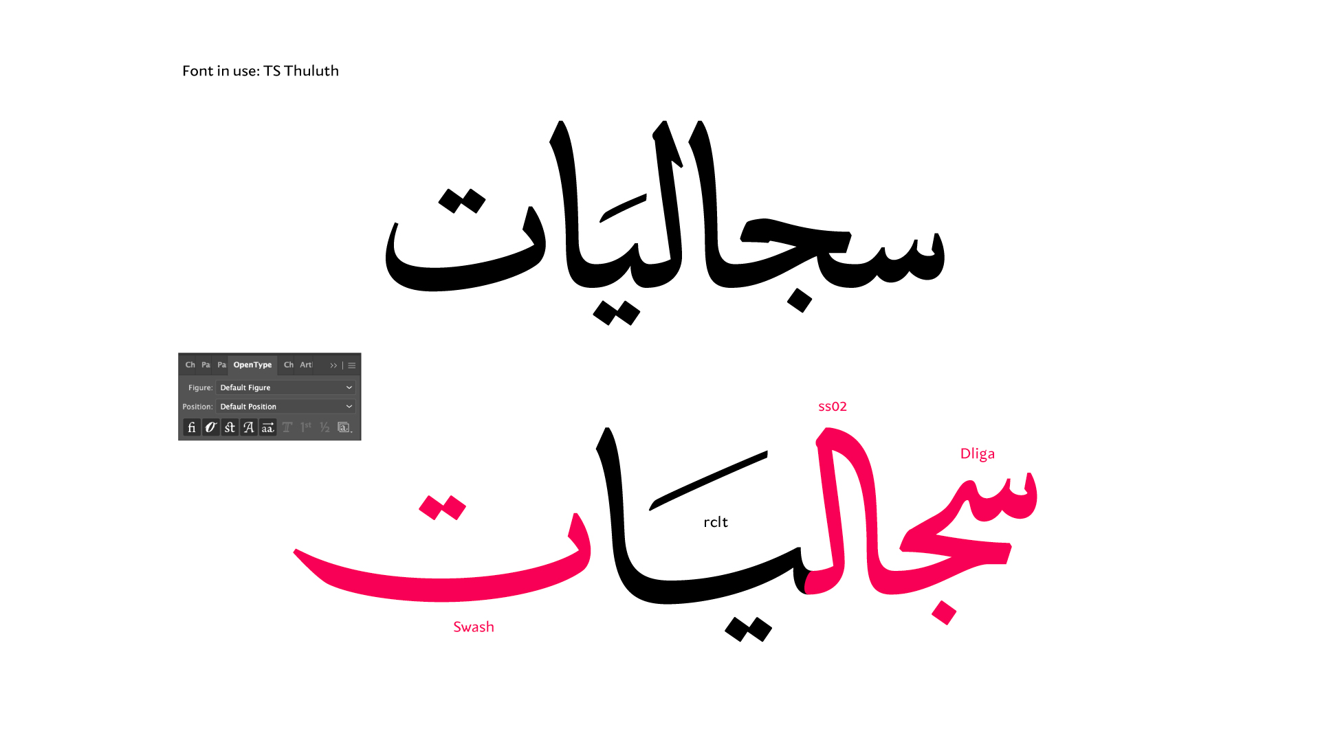
5. OpenType Features
Examples include ligatures, contextual alternates, stylistic sets, and swash forms.
The Process
1. Defining the Design Direction
What should we consider?
Intended use: extended reading, headlines, posters, and other applications.
Personality: rigid or fluid, formal or friendly, traditional or contemporary.
Language support: Arabic only, bilingual, or multilingual, together with the relevant writing and punctuation conventions.
Advanced technical requirements: variable font support and compatibility with browsers and applications.
Reference and competitor research: review six to ten comparable typefaces, examining stroke contrast, letterform skeletons, terminals, distinctive features, spacing, and kerning.
2. Sketching
Goal: draw and test ideas by hand before digitizing them.
Tools and approach
Paper and pencil, or an iPad.
Good practices
Focus on the letterform skeleton first, then refine stroke thickness and terminals.
Test the rhythm in short words rather than assessing individual letters in isolation.
Draw alternative forms when a visual decision is still unresolved.
3. Digitization
Goal: turn sketches into clean outlines that are ready for font engineering.
Common software
Glyphs, FontLab, FontCreator, and RoboFont.
Outline quality
Use a small number of correctly placed nodes to create smooth curves.
Maintain consistent stroke contrast.
Metrics and spacing
Set the baseline and vertical reference heights: the Latin x-height and the corresponding visual reference height in Arabic, together with ascender and descender values.
Establish initial sidebearings and use a test word to assess the rhythm of the spacing.
Considerations specific to Arabic
Set up anchors early for fatha, kasra, damma, shadda, and other diacritics, using the
markandmkmkfeatures.Ensure consistent joining through entry and exit anchors for cursive attachment, where needed.
Refine the size and shape of the dots and their relationship to stroke thickness.
4. Font Engineering
This is the “control room” of the process: it turns drawn letterforms into an intelligent font that responds to context and works smoothly across systems.
Positional forms: define initial, medial, and final forms for Arabic letters so that the appropriate form is selected automatically as the user types.
Diacritic positioning: position fatha, damma, kasra, shadda, and other marks precisely above or below the letters, avoiding crowding around dots and collisions with letterforms.
Joining and spacing: adjust sidebearings and refine specific kerning pairs to create balanced, legible lines of text, especially in extended reading.
Variable fonts: if the font is variable, define axes such as weight, width, and/or optical size, and ensure smooth interpolation across each axis—for example, from thin to heavy weights.
Style naming: give weights and styles clear names, such as Regular and Bold.
5. Testing and Release
Goal: ensure legibility, compatibility, and a reliable experience without technical problems or conflicts before release.
Visual and functional testing
Real content: articles, interfaces, headlines, and logos.
A range of sizes: 9–12 pt for body text and 24–72 pt for display use.
Different environments: print, including laser and offset printing, and screens running macOS, Windows, Android, and iOS.
Browsers and applications: Chrome, Firefox, Safari, Figma, Adobe applications, Office, and Canva.
Languages and writing directions: right-to-left and left-to-right text, Arabic–Latin combinations, punctuation, Arabic-Indic and Persian numerals, and quotation marks.
Release materials
Font files in OTF, TTF, WOFF, and WOFF2 formats, plus variable font files where applicable.
A license file explaining permitted uses.
A type specimen.
Images showcasing the typeface.
An OpenType feature guide.
Conclusion
Type design is a complex and rewarding journey that combines artistic creativity with technical precision. Behind every typeface we see on screen or in print are hundreds of hours of research, drawing, and engineering. Choosing the right typeface means choosing more than an attractive design: it means choosing a complete visual system that expresses a clear identity and message.